OrangeTwist: A brand glow up
OrangeTwist, a leading med spa in aesthetic treatments, didn’t need a total identity makeover. The brand had the structure—it just needed, well, in terms of aesthetics; a little tightening here, a bit of filler there, throw in some lasers, a facial and some body contouring, and a lot less clutter.
We refined, we elevated, and we built a cleaner, sharper design system that brought clarity to the OrangeTwist experience—without losing what made it OrangeTwist.
The result? A refreshed brand that looks as good as the results it delivers.
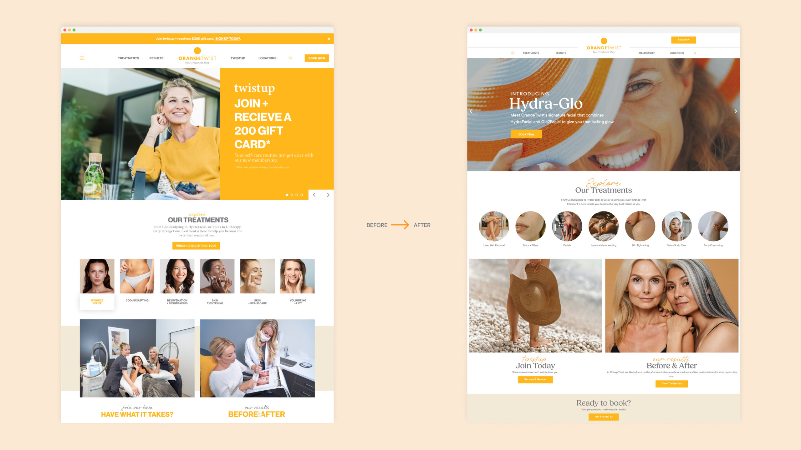
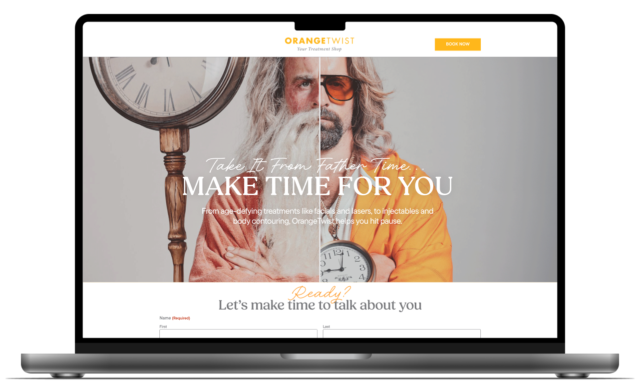
A Website with less scroll fatigue and More booking energy
We didn’t just reskin a template. We tightened the UX, streamlined the content, and made the visuals work harder. It’s now a site that feels as modern and elevated as the treatments it’s promoting.
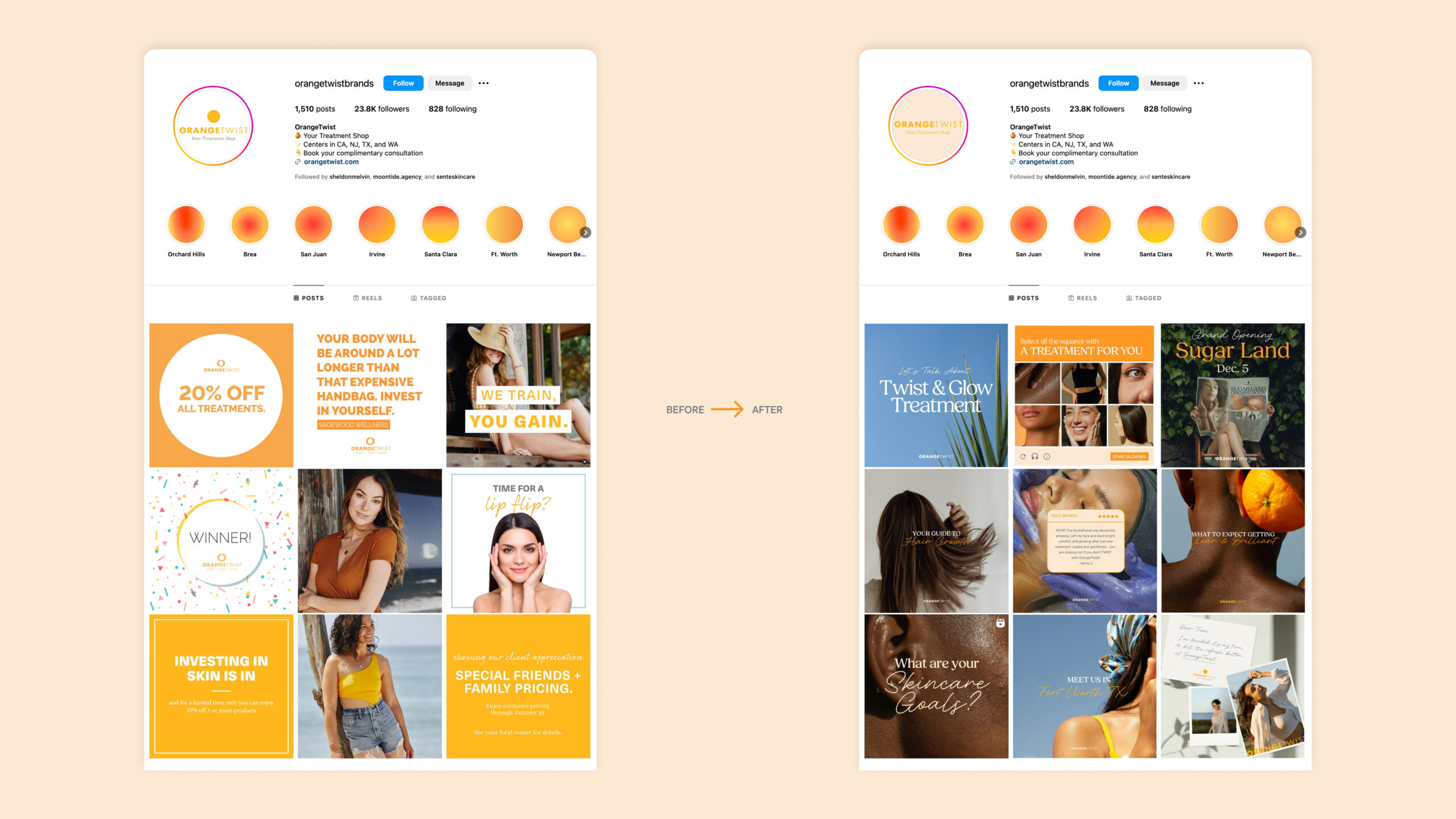
Social That’s Worth Following
The brand got a glow-up on Instagram, too. We brought in clean grids, bold type, editorial-inspired image treatments, and a tone that finally sounds like a brand you’d trust and hang out with. It’s pretty. But it’s also got personality.
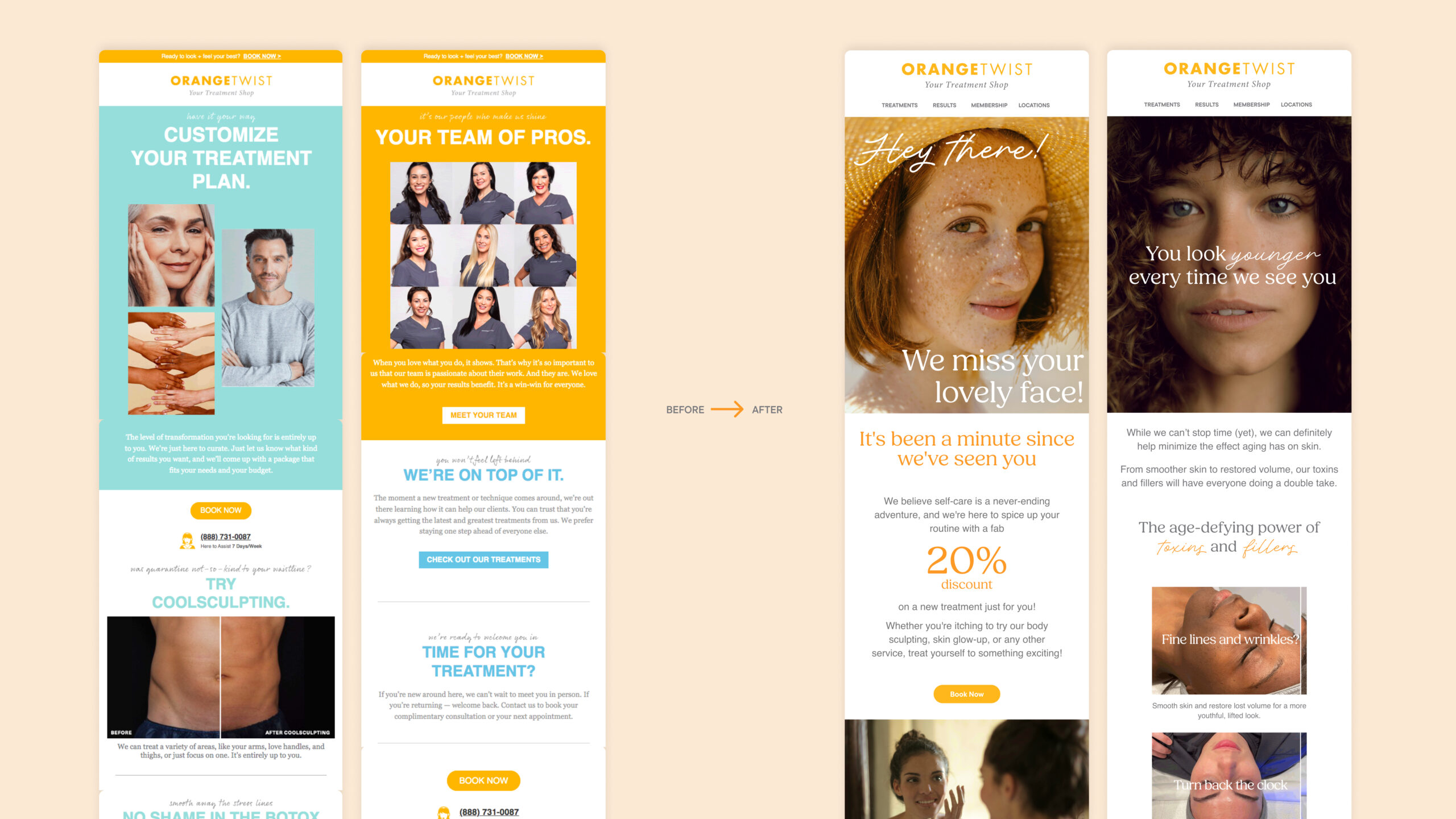
Emails That Don’t Go Straight to Trash
Gone are the cluttered headers and clunky layouts. We brought the emails in line with the new design system—elegant, scrollable, and conversion-minded. Still selling. Just doing it better.
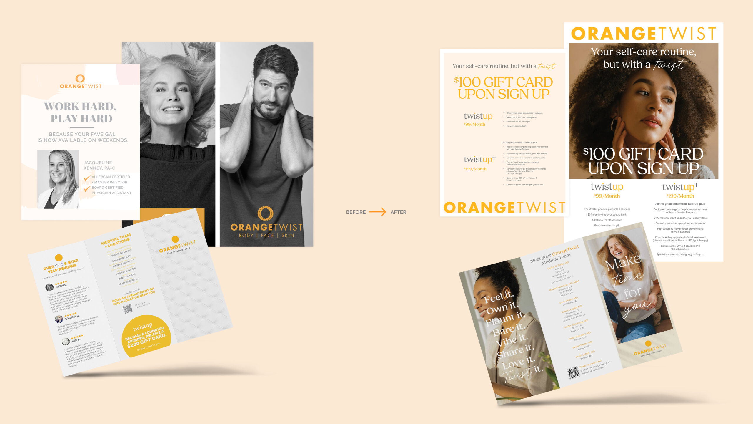
Print Materials That Actually Get Noticed
We gave OrangeTwist’s brochures, posters, and direct mailers a serious upgrade. Clean, confident, and designed to be kept—not recycled. A little hierarchy and some high-end restraint go a long way.
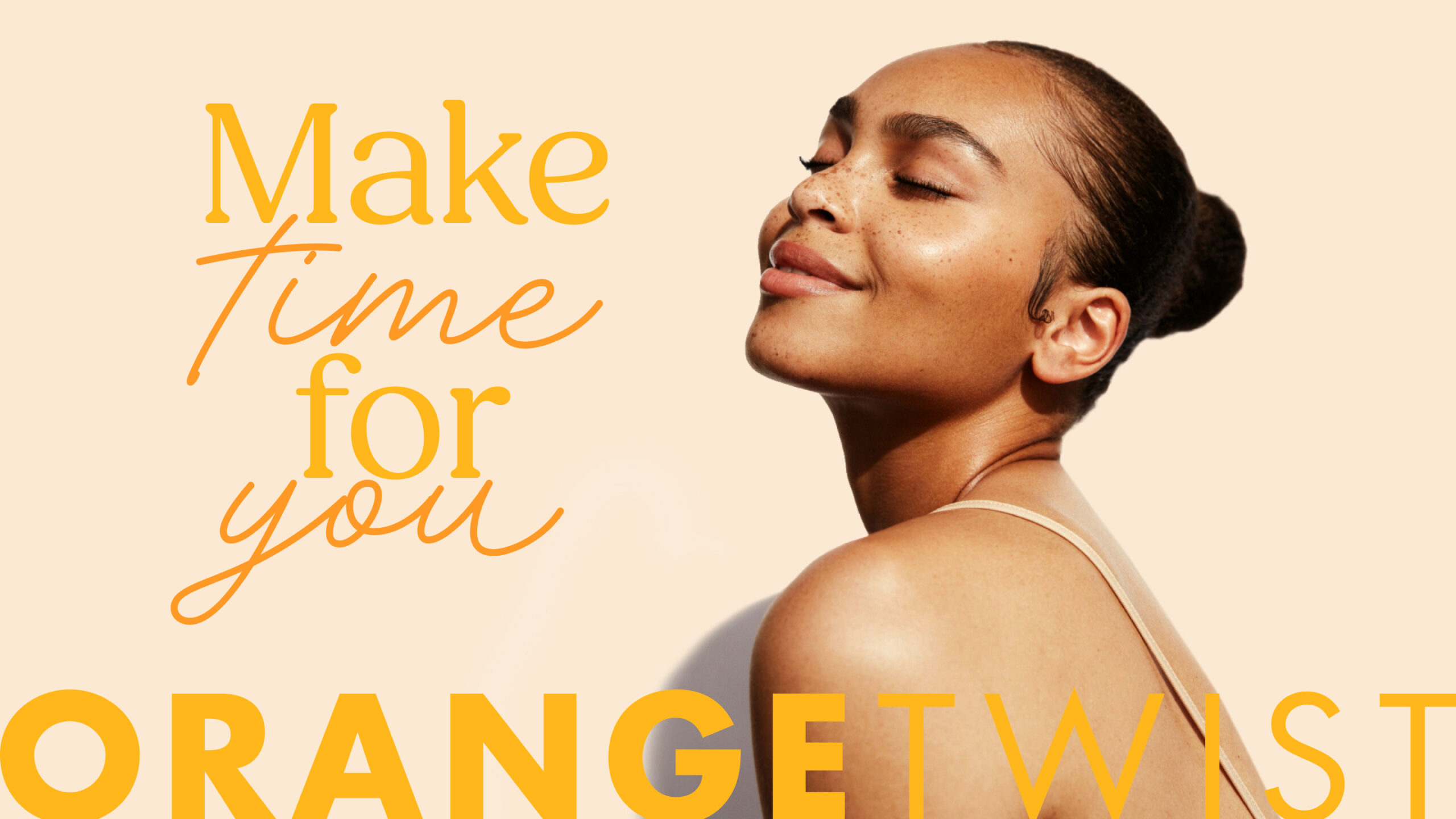
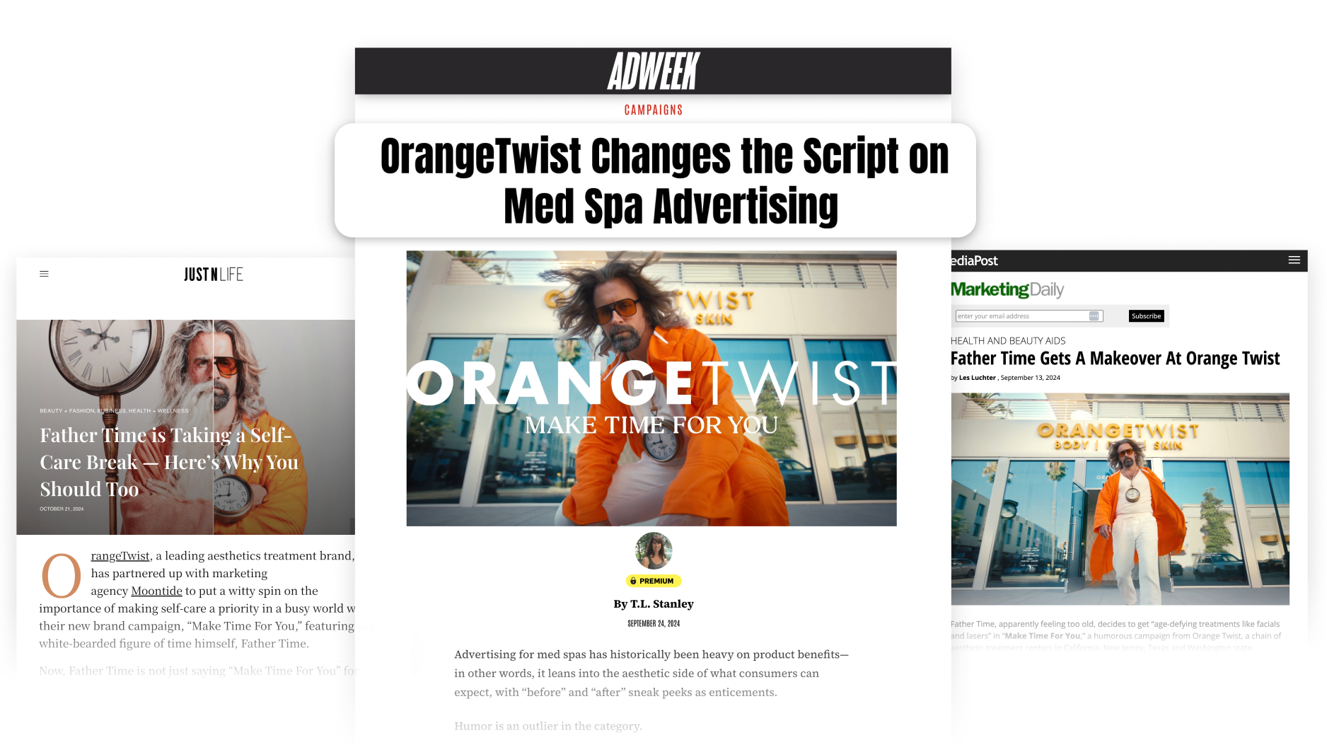
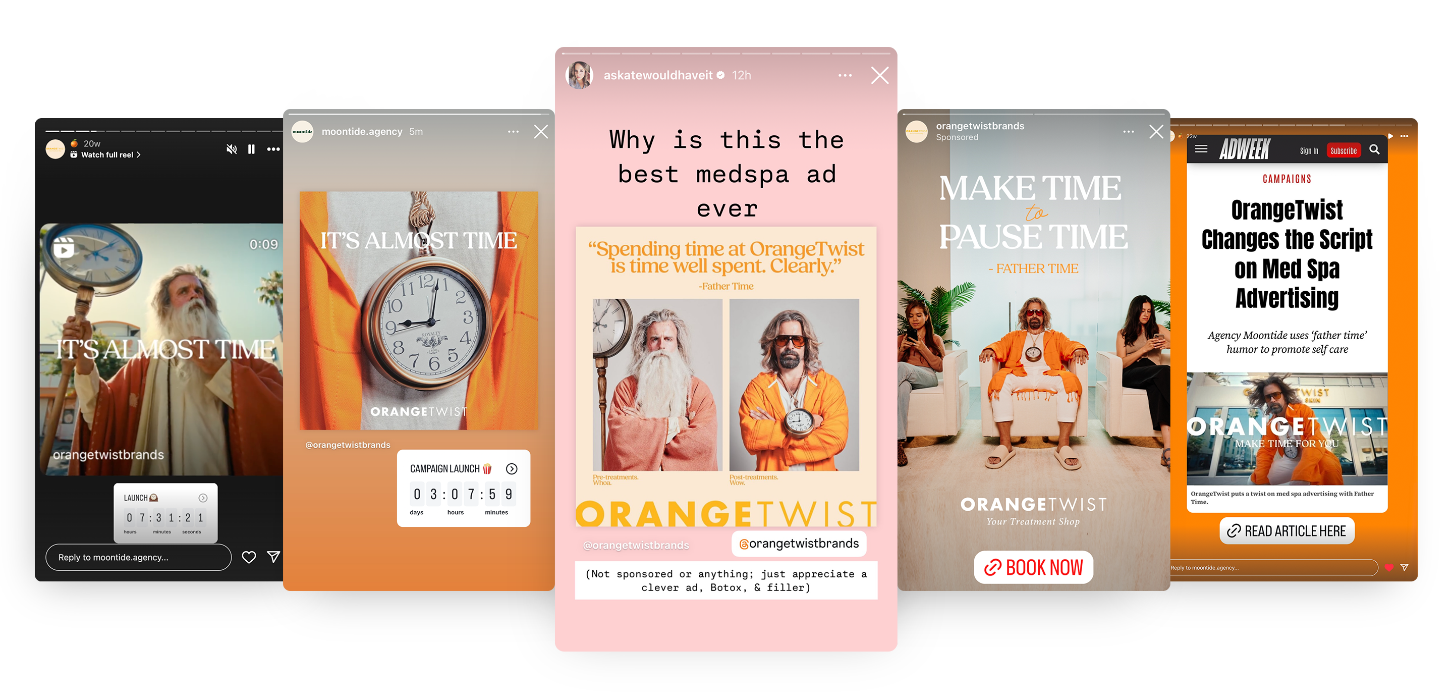
Father Time: The Ultimate Brand Expression
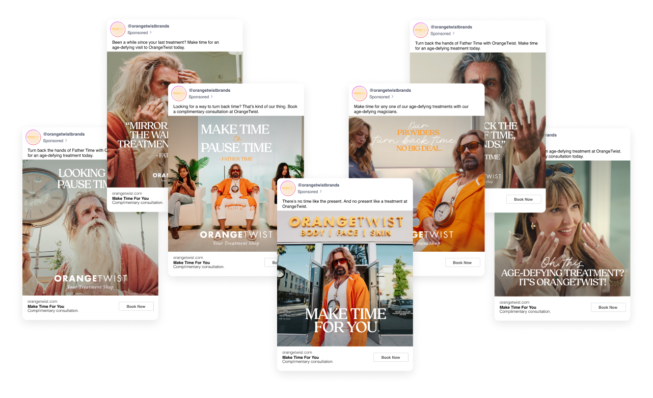
Enter: Father Time. He’s tired, wrinkled, and exactly the kind of unexpected character who could bring our refined brand to life in a totally new way. The “Make Time For You” campaign took a fresh, inclusive approach to connect to a broader audience. The campaign stood out for its use of humor—something rarely seen in aesthetics marketing—and broke the mold on the conventional image of beauty, delivering the message that self-care is accessible to all.
First, Father Time was transformed from an age-old symbol of aging into a youthful advocate for self-care. We then spread the word about OrangeTwist as the premier med spa to go to make time for yourself.
This wasn’t beauty marketing as usual. Every design choice was crafted to demand attention and drive action.
✔ A Character With Personality – Father Time wasn’t just a concept—he was a fully realized visual character, blending editorial storytelling with an unexpected edge.
✔ Typography That Owned the Space – Clean, modern type in bold layouts made the message impossible to ignore.
✔ Color & Texture That Elevated the Brand – A luxe, sun-drenched palette grounded the humor, ensuring it felt high-end, not gimmicky.
✔ Cinematic Video & Motion Design – Every frame was meticulously crafted to blend storytelling with stunning visuals.
✔ A Fully Integrated Design System – From OTT and paid social to in-store signage and email, the design was instantly recognizable everywhere.
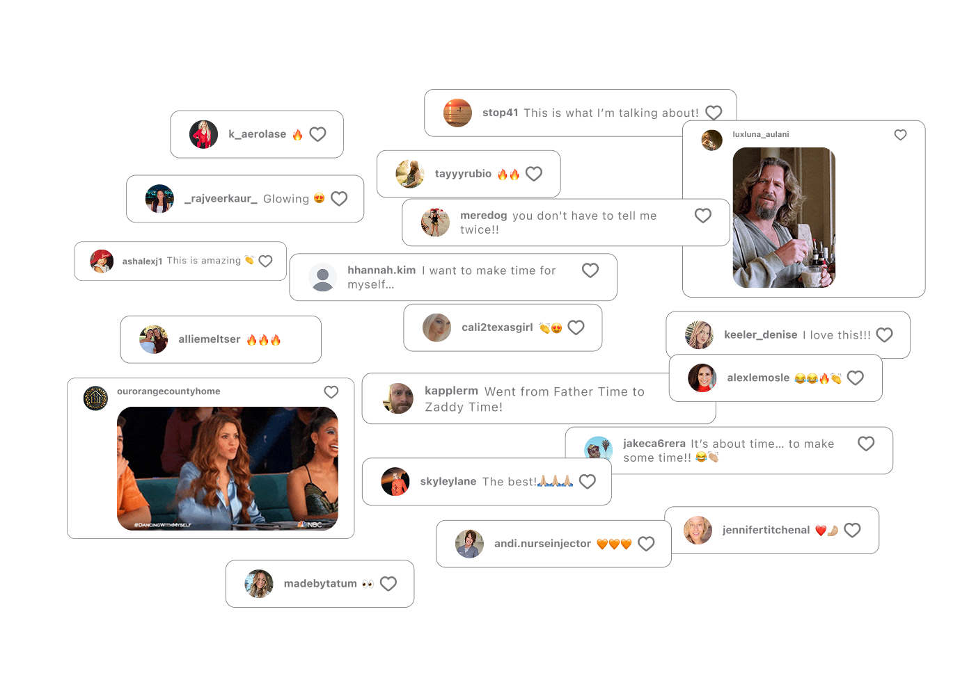
PEOPLE STARTED MAKING TIME. THE CAMPAIGN MADE SERIOUS IMPACT.
5x
Increased conversion rate
2x
Monthly lead volume
22%
Increased brand awareness
1544%
Increased in social mentions
50%
Decreased CPA